Gallery of prints for sale

Thursday, 19 September 2013

An Evolution in Representation (Part Three): Chuck Close and Brown

What are some of the historical approaches used by artists to represent what they see?


In the first instalment of this four-part survey focussed on the evolution of key approaches adopted by artists to portray their vision of reality, I mentioned two ducks—George and Mildred—that I feed during my morning walks. I have decided to return to these ducks for this third instalment and use them as illustrations of the perceptual phenomenon observed when viewing them through a single eye or the lens of a camera. The ramifications of this type of vision, appropriately termed monocular vision, is significant, as the representation of reality resulting from a single eye/lens view underpins most of today’s commercial photographic images and the artworks of artists who use photographs as a resource, such as Chuck Close (see clip below).


Chuck Close: A Portrait in Progress || Trailer
MUSE Film and Television

Essentially the effect of looking through a single lens or eye is that a plane parallel to the frame-of-view (i.e. the eye or camera lens) may be in focus but all features seen in the front of this plane and behind it are out-of-focus. This phenomenon is different to the effect of looking through two eyes in that vision registered through two eyes (i.e. binocular vision, discussed in the previous post) creates a single point of focus with focal clarity diminishing in 360 degrees away from this point (technically termed the point of fixation).

To demonstrate the pictorial effect of monocular vision, I took a photograph of George and Mildred and adjusted the focus in Photoshop (see below) so that the head of the duck in the foreground—hopefully it is a male duck as this is the one that I have named “George”—is in focus, while his mate—Mildred—in the background is rendered out-of-focus.

Monocular vision with the focal plane set on the front duck, George
(Photoshop manipulation)
In the next digitally modified photograph (shown below) I have moved the focus onto George’s feet. Mindful that with monocular vision the focus is on a whole plane parallel to the eye/lens, this means that all featured subject matter that is parallel with George’s feet and the horizontal edge of the photograph will also be in-focus. Consequently, the pebbles to the right and left of his feet are also portrayed with focal clarity. Importantly, all the subject matter in front of this in-focus plane featuring George’s feet and pebbles are shown progressively as out-of-focus.

Monocular vision with the focal plane set on George’s feet
(Photoshop manipulation)
The third digitally modified photograph (shown below) has the focal plane shifted to the demure Mildred positioned behind George. Again, all portrayed subject matter on the same focal plane as Mildred is in focus while behind and in front of her focal clarity is gradually lost.

Monocular vision with the focal plane set on George’s mate, Mildred
(Photoshop manipulation)
One may assume that a photograph like that of George and Mildred is a genuine pictorial capture of a split-second moment in time. Of course, the changing depth of field in a photograph with its capture of monocular vision cannot be a true representation of what is perceived for those who see the world through two eyes. Interestingly, however, the idea that each eye independently reads an image and that the brain then synthesises the two separate views into a single vision—binocular vision—is the core principle behind the stereoscopic images called anaglyphs; such as the digitally altered photograph of the ducks and the illustrations for the DC comics shown below.

Anaglyph of George and Mildred
(I would be very pleased to replace this image with an improved version
if a more technically skilled reader wishes to assist)

Jerry Siegel and Joe Shuster (creators of Superman)
(Left image) Superman Red / Superman Blue, February, 1998, DC Comics, New York
3-D edition cover separated by Ray Zone
The interior pages of this comic do not feature anaglyphs.
(Centre image) Three-Dimension Adventures / Superman, 1997, DC Comics, New York
All the interior pages of this comic are anaglyphs
(Right image) glasses packaged with Three-Dimension Adventures / Superman
Condition: Superman Red / Superman Blue is in pristine condition and Three-Dimension Adventures / Superman has a minor scuff mark affecting the last two pages. I am selling both of this comics and the glasses as issued in the 1997 publication for a combined cost of [deleted] including postage and handling to anywhere in the world. Please contact me using the email link at the top of the page if you are interested.


Initially developed by Wilhelm Rollmann in 1952, the processes involved in the creation of an anaglyph has evolved over the years (see http://en.wikipedia.org/wiki/Anaglyph_3D for a listing of the variants and most recent advances). A fundamental approach to creating anaglyphs involves the overlaid juxtaposition of two slightly variant images (usually a red and a cyan image) created for each eye so that the binocular perception of two eyes filtered through different coloured lens (usually a red lens for the left eye and cyan for the right) synthesises the two viewpoints into a single coherent three-dimensional image.

With two eyes open and without the help of specialised glasses artists can approximate the effect of monocular vision. This is demonstrated very clearly by many of the images of Chuck Close. Beyond referencing the phenomenon of a single plane of focus in photography, artists can also use the effect of monocular vision to help project meaning and sustain a viewer's interest. For instance, in my diptych (i.e. two panel) ink drawing of mangroves shown below, the focus is on two separate clusters of leaves that are on the same spatial plane: one of these clusters is featured at centre of the the left panel and the other is shown on the right panel towards its right side (see details below). By design, this pair of leaf clusters acts as a dual design element spanning and pictorially connecting both panels of the diptych. I also wished them to be seen as points of interest embodying in miniature the sparkling effects that I experienced when being in mangroves. In short, my use of monocular vision in this drawing is an aid to composition and as a way to highlight the critical experience that I wished to express.


James Brown
Mangroves (diptych), 2013
Ink on 300gsm Saunders watercolour paper
76 x 116 cm (each panel 76 x 58 cm)
Condition: unframed with no condition issues
I am selling this diptych drawing for $1550 AUD including postage and handling to anywhere in the world. This is a large drawing and will be posted rolled in a tube. Please contact me using the email link at the top of the page if you are interested.


(Upper) left panel of Mangrove
(Lower) detail of left panel

(Upper) right panel of Mangrove
(Lower) detail of right panel

In the next post I will move the discussion of artists' approaches to portraying their vision to the fascinating field of gestalt theory.

Wednesday, 7 August 2013

An Evolution in Representation (Part Two): Brown, Corot, Whistler, Brouet, Vuillard & Appian

What are some of the historical approaches used by artists to represent what they see?


This is the second instalment of four posts exploring different principles used by artists to represent their vision. The last post discussed a principle employed by many Renaissance artists in which all the portrayed features of an image are rendered with the same degree of focal resolution: a type of vision that I termed for expedience, “consecutive vision,” because each portrayed feature can be examined consecutively. The following discussion examines the principle of binocular vision popularised by the Impressionists wherein the convergent focus of two eyes on a single point of interest is perceived in sharp focus while features lying away from this point in 360 degrees are seen progressively as out-of-focus. This phenomenon of optical convergence on a single point is illustrated in my drawing, The Common (shown below). By design, The Common portrays an observation during a moment of fixated gazing through a screen of trees in Townsville’s Common (a nature reserve not far from where I live) to a tree in the distance. To recreate this momentary observation, the drawing features the point of fixation of my gaze rendered in pictorial detail. The tunnel-like arcade of trees surrounding this point of fixation is depicted with an increasingly broader handling of marks signifying degenerating focal clarity.

James Brown (1953–)
The Common, 2006–12
Ink and acrylic on 300gsm Saunders watercolour paper
57 x 75.5 cm
I am selling this drawing for a total cost of $900 AUD including postage and handling to anywhere in the world. This is a large drawing and will be posted in a tube. Please contact me using the email link at the top of the page if you have any queries or click the “Buy Now” button below.

This painting has been sold


Details of The Common
There are many ways that artists employ the principle of binocular vision. For instance, whereas I used a hierarchy of mark attributes ranging from fine pen lines at the centre-of-interest to wide strokes with a brush towards the peripheral edge of the drawing, some artists rely entirely on showing variation in the quantity of detail depicted; namely, an abundance of detail at the point of focus and a lessening in the quantity of detail shown away from this point. For example, Jean-Baptiste Camille Corot’s (1796–1875) cliché-verre [a print made photographically on treated paper in the manner of a photogram using a glass plate coated with an opaque ground through which the design is scratched so as to make a transparent negative], The Woods of the Hermit (shown below), exemplifies an entire image drawn with the same thickness of line. In short, the detailing and tonal contrast of the diminutive, but distinctive, silhouette shape of a figure on a hillside makes the figure the key point of focus whereas the representation of the rest of the scene is treated with far less detailing.

Jean-Baptiste Camille Corot (1796–1875)
The Woods of the Hermit (or Shores of Lake Trasimeno)
Cliché-verre (glass plate in the British Museum) on cream wove paper
16.5 x 22.9 cm (image); 18.6 x 25.7 cm (sheet)
Melot 72; Robaut 3192   
Condition: rich impression, with margins in excellent condition.
I am selling this cliché-verre for a total cost of $780 AUD including postage and handling to anywhere in the world. Please contact me using the email link at the top of the page if you have any queries or click the “Buy Now” button below.


This print has been sold


Details of Corot’s The Woods of the Hermit
A key feature of most artworks featuring binocular vision is that they are formatted as a vignette (i.e. an image that pictorially dissolves towards the edges of the format). For instance, in James Abbott McNeill Whistler’s (1834–1903) etching, The Little Putney, No. 1 (shown below), the eye is invited to contemplate the right side of the featured bridge by virtue of the strong line work in this area before resting on the finely rendered tower beyond it. By design, Whistler uses the vignette treatment to gradually decrease the amount of portrayed detail away from the point of focus so that the outer edge of the image is light in tone.

James Abbott McNeill Whistler (1834–1903)
The Little Putney, No. 1 (1879)
From the edition of two hundred impressions published by the Fine Art Society, London (1883)
Etching on cream wove paper
13.4 x 20.8 cm (plate); 31.6 x 24.8 cm (sheet)
Kennedy 179 ii/ii
Condition: crisp, strong impression with wide margins in near pristine condition.
I am selling this print for a total cost of $1230 AUD including postage and handling to anywhere in the world. Please contact me using the email link at the top of the page if you have any queries or click the “Buy Now” button below.

This print has been sold
View of whole sheet
Detail of Whistler’s butterfly signature


Details of Whistler’s The Little Putney, No. 1
A similar vignette treatment from dark details at the image centre to lightly denoted forms at the peripheral edge of the image may also be seen in Auguste Brouet’s (1872–1941) etching, Marchand des Légumes [Vegetable Seller] (shown below). Here, the transition from velvety rich black lines depicting the artist’s focus on the market sellers to the palest hint of fine lines at the outer edge of the image is an excellent example of binocular vision.

Auguste Brouet (1872–1941)
Marchand des Légumes [Vegetable Seller]
Etching on cream wove paper
12.1 x 18.5 cm (plate); 22.7 x 27.9 cm (sheet)
19/100, signed in pencil
Boutitié 189
Condition: superb impression with wide margins in good condition. There are collector’s notations on the top left and along the bottom margins (recto) and a collector’s ink stamp and signature (verso).
I am selling this print for a total cost of $142 AUD including postage and handling to anywhere in the world. Please contact me using the email link at the top of the page if you have any queries or click the “Buy Now” button below.


This print has been sold


Details of Brouet’s Marchand des Légumes
The concept of using a vignette treatment for representing binocular vision does not mean that the portrayed subject must fade to the colour of the paper. For instance, Edouard Vuillard’s (1868–1940) etching, Interieur au Canape ou Soir (1930) (shown below) and Adolphe Appian’s (1818–98) Village de Villeneuve (1869) (shown further below) demonstrate how artists can fade their portrayed subject into darkness at the periphery of the format.


Edouard Vuillard (1868–1940)
Interieur au Canape ou Soir (1930)
From the publication Le Tombeau d’Edouard Vuillard (this is not a restrike but an original impression)
Signed in the plate with the initials “E V” (lower left)
Etching on laid paper with 2.6 cm chain lines
9.8 x 15 cm (plate); 23.7 x 33.2 cm (sheet)
iii/iii
Claude Roger-Marx 62
Condition: fine impression in excellent condition (this is not a restrike impression printed on wove paper). There are remnants of archival mounting tape (verso).

I am selling this print for a total cost of $268 AUD including postage and handling to anywhere in the world. Please contact me using the email link at the top of the page if you have any queries or click the “Buy Now” button below.

This print has been sold

View of whole sheet


Edouard Vuillard’s initials

Details of Vuillard’s Interieur au Canape ou Soir
Adolphe Appian (1818–98)
Avant La Pluie, Village de Villeneuve [Before the Rain, Village of Villeneuve] (1869)
Etching on cream wove paper
16 x 23.9 cm (plate); 19.8 x 28.3 cm (sheet)
Signed and dated in the plate (upper left)
Inscribed “Appian sc.” (lower left); “AVANT LA PLUIE/Village de Villeneuve./Paris. CADAET & LUCE. Editeurs Imprimeurs. Rue Nve des Mathurina. 58” (lower centre)
Condition: crisp and strong impression in good condition. There is toning to the image and light abrasions.
I am selling this print for a total cost of $138 AUD including postage and handling to anywhere in the world. Please contact me using the email link at the top of the page if you have any queries or click the “Buy Now” button below.
This print has been sold
View of whole sheet

Details of Appian’s Avant La Pluie, Village de Villeneuve
From a very different perspective, the idea of directing an audience’s attention to a specific point of interest is not limited to visual representation. I mention this as I recently attended a chamber music performance and I was struck by how the orchestration of the music focussed my attention on a particular instrument and musical line. Arguably, the principle employed in capturing my attention is the same as used by artists to draw attention to the centre-of-interest in an image: namely, contrast between the treatment of the centre-of-interest and the treatment of its immediate surroundings. In terms of music, this contrast may be between a clear and captivating melody line played on a clarinet and ambient sounds of massed violins. But, of course, this type of contrast in music and the visual arts is seldom simple and usually involves a network of relationships to sustain interest and project meaning. This is because the focus of two eyes or two ears on a point of interest undergoes constant shifting and revaluation for meaning to be negotiated. To explain the complexities involved, I wish to rely on Tolstoy’s famous description of a collapsing tree from Three Deaths, as his account guides the reader through shifts of visual and auditory focus and subtle comparisons in creating a word-picture of the tree’s demise—a sequence of contemplating a point of fixation before moving to the next:

The sound of the axe at the bottom grew duller and duller. Sappy white chips flew onto the dewy grass and a slight creaking could be heard above the sound of the blows. The tree, shuddering from top to toe, bent over and quickly straightened up, shaking with fear on its roots. For an instant all was still, but then the tree bent again, another crack sound came from its trunk, and with its branches breaking and its bough hanging down it fell crown-first onto the damp earth. (Tolstoy, Leo [trans. Louise & Aylmer Maude] 1933, Nine Stories by Leo Tolstoy [Tolstoy Centenary Edition], London, p. 307)

Friday, 12 July 2013

An Evolution in Representation (Part One): Wierix; Lorrain; Poussin; da Vinci; Michelangelo; Mellan; Pitteri: Bowen; Houbraken & Fantin-Latour

What are some of the historical approaches used by artists to represent what they see?


One of the joys of living today is being able to access a virtual sea of information. For instance, only this morning I was feeding a pair of neighbourhood ducks—George and Mildred—and silly quandaries about their life expectancy and why they wag their tails so furiously were quickly answered with a Google search on my phone: I discovered that ducks live for around ten years (unless eaten earlier) and the reason that they wag their tails is because they are happy or that they have just had a bath and were wiggling their tails to dry their bottoms. Twenty years ago the idea of trying to find answers to such idle musings would have been relegated to the pit of “pointless questions that are too hard to answer” as the task of determining what would be an appropriate book to consult and finding it would have been too difficult. Despite today’s easy access to information, there is still thinness in freely available web-based information on some topics. This is especially true regarding how artists’ perceptions of reality have evolved through history. By this I am not referring to the discovery of principles such as perspective or innovative shading techniques like the dotted lozenge for portraying form (discussed in the earlier post, “Dotted Lozenge”) or even a timeline of “big bang” moments of period styles in art. Rather, I am referring to a much simpler history that documents the evolution of how artists “thought” that they perceived the temporal world.
Without apologising too much for nipping off inconvenient truths about how artists represent the world around them, the following discussion is the first of four accounts focused on explaining four pivotal ways and the principles underpinning them that artists have applied to portray their vision:
· Consecutive vision—a way of looking at a subject employed during the Renaissance where the artist consecutively examines and renders each portrayed feature with the same degree of focal clarity;
·    Binocular vision—a way of looking at a subject employed by many Impressionists where the artist perceives a point of convergence through the simultaneous effect of looking with both eyes open at a focal point while clarity diminishes in 360 degrees away from this point focal;
·    Monocular vision—a way of looking at a subject employed by Photo-realists where the artist examines a subject through one eye (like the lens of a camera) at a plane of focal clarity parallel to the eye while in front of this plane and behind it focal clarity diminishes; and,
·  Gestalt vision—an term coined for convenience rather than accuracy employed by many contemporary artists to portray a subject in a way that takes into account current perception theory such interpreting a subject based on points of focal fixation and the ever-expanding theories regarding how the mind interprets configurations of critical details from one moment to the next.

For this first instalment, I will focus on Consecutive vision and its ramifications for both the artist and viewer. 
Heronymous Jerome Wierix (1443–1619)
The Flagellation, 1619 (before)
From the series, The Passion of Christ
Engraving on laid paper
Inscribed below image: Ipse vulneratus est propter iniquitates/nostras; disciplina pacis nostrae super eum,/& liuore eius sanati sumus. Isaiae 53/Hieronymus Wierx fecit et excud. Cum Gratia et Priuilegio. Buschere.
8.4 x 5.2 cm (sheet)
Mauquoy-Hendrickx 173; Alvin 348; Hollstein 213 (The Wierix family) 
Condition: very fine impression trimmed to border line and hinged to mount with two pieces of archival tape on the back. Also on the back, is an ink inscription by a previous collector
I am selling this rare engraving for $127 AUD including postage and handling to anywhere in the world. Please contact me using the email link at the top of the page if you are interested or click the “Buy Now” button below.

This print has been sold
During the Renaissance, artists were fully aware of the need to ensure that figures of religious or social importance were portrayed in ways signifying their elevated status. After all, financial success and reputation rested on meeting this expectation of the artist’s patrons and audience. For example, Heronymous Jerome Wierix’s (1443–1619) portrayal of Christ in The Flagellation (shown above and with details below) is designed to present Christ as more than an ordinary man in terms of his halo. Moreover, Christ is marginally taller than his surrounding tormentors and bathed in light in the middle of the scene. This obligation to make the key subject pictorially arresting and conceptually important (i.e. “special”), does not mean that Christ is also depicted in sharper focus than any other feature. Instead all features are displayed with the same degree of focal clarity and it is this focal democracy which defines the principle of consecutive vision.


Details of Wierix’s The Flagellation
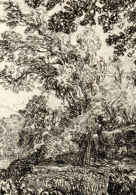
With regard to landscape imagery and the use of consecutive vision, Claude Lorrain (1604/5?–1685) and Nicolas Poussin (1594–1695) are fine exemplars. Lorrain’s way of portraying animals, for instance, is similar to his treatment of trees and surrounding terrain, as shown below in his etchings: The Vision [L’apparition] and The Two Landscapes [Les deux paysages]. Similarly, Poussin drawings, such as The Death of Germanicus (c.1626-7), exemplifies a way of looking wherein no element in his composition has more attention given to its depiction than the next. One consideration that should be borne in mind regarding Poussin and other artists who apply consecutive vision is that what is depicted is not necessarily what is signified. In the case of Poussin, according to Christel Godicke in the foreword to Oskar Batschmann’s rich and insightful Nicolas Poussin: Dialectics of Painting (1990) “He differentiates between the simple and natural kind, the aspect, and the attentive observation of objects, the prospect, which looks for the means of understanding vision and perceiving objects” (p. vii).

Claude Lorrain (1604/5? –1685)
The Vision [L’apparition], 1630?
Etching on wove paper
State v (of v) published in the 1816 Schulze edition of 200 Etchings
10.4 x 17.1 (plate); 10.9 x 17.4 cm (sheet)
Robert-Dumesnil 2; Blum 3; Knab 121; Duplessis 2; Russell 7; Mannocci 5
Description from the British Museum:
“The apparition; at the edge of a wood, near a river, a cleric listening to an angel, with a city in the background.” (http://www.britishmuseum.org/research/collection_online/collection_object_details.aspx?objectId=1346348&partId=1&searchText=claude+lorrain+etching&page=1 [viewed 9th July 2013])
Condition: very rich, well-inked impression, trimmed close to plate mark in near pristine condition.
I am selling this print for $230 AUD including postage and handling to anywhere in the world. Please contact me using the email link at the top of the page if you are interested or click the “Buy Now” button below.

This print has been sold

Detail of Lorrain’s The Vision

© The Trustees of the British Museum
Claude Lorrain (1604/5? –1685)
The Two Landscapes [Les deux paysages], 1630?
Etching
13.2 x 20.1 cm
Robert-Dumesnil 40; Blum 42; Knab 114; Duplessis 42; Russell 6; Mannocci 4
The British Museum: 1973,U.641
Curator’s comment from the British Museum:

The two impressions shown below are from the 1816 publication, 200 etchings. In this publication, the two images were separated and presented as two prints.
I am selling both of these small prints (upper print is 6 x 4.2 cm; lower print is 5.9 x 5.3 cm) that came from the same plate for a combined total price of $210 AUD including postage and handling to anywhere in the world. Please contact me using the email link at the top of the page if you are interested or click the “Buy Now” button below.


These prints have been sold

© The Trustees of the British Museum
Nicolas Poussin (1594–1695)
The Death of Germanicus [La mort de germanicus], c.1626–7
Pen and brown ink, with brown wash
18.3 x 25.6 cm
Collection: British Museum

As always, there are exceptions to any rule. Especially the idea that all Renaissance art is the result of what I have described as consecutive vision. At this point I must admit to an inconvenient truth: some Renaissance images do not conform to the principle that all pictorial features are rendered with the same degree of focal clarity. For example, there may be a case to argue that Leonardo’s The Mona Lisa (La Gioconda in Italian, or La Joconde in French) (shown below) reveals a change in focal clarity from foreground to distance resulting from Leonardo’s  depiction of the smoky effect of atmospheric haziness—an effect termed, sfumato, created by the softening of a subject’s edges. There are also many Renaissance drawings displaying a vignette treatment and which clearly show greater focal clarity towards the central area of the images than at their peripheral edge (see, for example, Michelangelo’s drawing, The Erythraean Sibyl, shown further below).

Leonardo da Vinci (1452–1519)
The Mona Lisa (La Gioconda [Italian] or La Joconde [French]), c. 1503–19
Oil on wood (poplar panel)
77 x 53 cm
Musée du Louvre, Paris
Detail of The Mona Lisa
© The Trustees of the British Museum
Michelangelo di Lodovico Buonarroti Simoni (1475–1564)
The Erythraean Sibyl, 1508–12
Michelangelo catalogue page 118 Ex. no. 19 recto 
Brown wash and pen and dark brown ink over a black chalk under-drawing
38.4 x 25.8 cm
Museum number: 1887,0502.118,
Beyond the issue that not all Renaissance images reveal the use of consecutive vision, I also wish to propose that the idea of portraying all pictorial details with the same degree of focal clarity did not end with the Renaissance. Certainly the grand tradition of academic art celebrates the value of portraying the chosen subject with finely tuned focus on all details depicted, as may be seen in J.T. Bowen’s nineteenth century training manual for budding academic students, Studies of the Human Figure (shown below). Interestingly, this approach of consistent sharp focus appeals to most art students at their beginning stage as they wish to portray their chosen subject with as much detail as possible. Of course, they later realise that a plethora of detail can be visually indigestible for viewers and that the adage, “less is more” (a phrase from Robert Browning’s 1855 poem, Andrea del Sarto [called The Faultless Painter]) provides a more inviting image for viewers to contemplate.

J.T. Bowen
Studies of the Human Figure. Circa 1850
18 loose lithographs in damaged binding cover
25.5 x 33.5 cm (cover); 24 X 33cm (lithograph sheet)
Condition: all sheets in the book are loose and show signs of handling (several of the sheets even have a “student” copies in pencil on their verso) with light soiling, chipping of sheet edges and age toning.
I am selling this book of lithographs for $186 AUD including postage and handling to anywhere in the world. Please contact me using the email link at the top of the page if you are interested or click the “Buy Now” button below.
This book has been sold
Illustrations from J.T. Bowen’s Studies of the Human Figure
Arguably, Claude Mellan’s (1598–1688) engraving, Sudarium of Saint Veronica [Veil of St Veronica] (1649) shown below, is a prime example of stylistic consistency in applying consecutive vision. This engraving is a feat of technical virtuosity in that by use of a single spiralling line Mellan has portrayed Christ’s image that miraculously appeared on St Veronica’s veil after the saint wiped Christ’s head on his way to Calvary. The single spiralling line renders the image of Christ as a filtered pattern wherein all his portrayed features share the same focal clarity—with the exception of the tip of his nose where the spiral terminates.


Claude Mellan (1598–1688)
Sudarium of Saint Veronica [Veil of St Veronica] (1649)
engraving
42.9 x 31.7 cm
(http://en.wikipedia.org/wiki/File:Claude_Mellan_-_Face_of_Christ_-_WGA14764.jpg 
[Viewed 9 July 2013])

Detail of Mellan’s Sudarium of Saint Veronica
Another approach to achieving consistency of style and focal clarity is exemplified by Giovanni Marco Pitteri’s (1703–1767) use of parallel lines phrased with varying thickness. In his engravings shown below, St Francis, after Ribera, and The Release of Peter from Prison, after Ribera, his use of parallel strokes to render light and shade is not designed to give contoured form to the portrayed figures in the sense of each stroke matching the curves of the surfaces depicted. Instead, the parallel lines give conceptual distance to the scenes as if the viewer were looking through a fine fabric scrim. To fully appreciate the effect of Pitteri’s style of rendering, compare his two engravings with Jacobus Houbraken’s (1710–80) The Sacrifice of Manoah that is a similar scene executed with cross-hatching strokes replicating the contours of the surfaces depicted. 

Giovanni Marco Pitteri (1703–1767)
St Francis on the Thorns, c.1750, after a painting by José de Ribera (1591–1652) in the Royal Collection (Gemäldegalerie) in Dresden. Nineteenth-century impression, published in Recueil d'estampes d'après les plus célèbres tableaux de la Galerie Royale de Dresde, edited by Carl Heinrich von Heineken, 1753–57 (see http://commons.wikimedia.org/wiki/Gem%C3%A4ldegalerie
_Alte_Meister_%28Dresden%29,_%C3%9Cbersicht_Galeriewerke [Viewed 10 July 2013]) This print is described by the British Museum as “An angel appearing to St Benedict of Nursia [rather than St Francis] who is stretched out on the ground on a bed of brambles” (http://www.britishmuseum.org/research/collection_online/collection_object_details.aspx?objectId=3005899&partId=1&searchText=Marco+Pitteri&images=true&page=1 [Viewed 10 July 2013])
Engraving and etching on wove paper
36.9 x 41.4 cm (plate); 47.3 x 62.5 cm (sheet)
Condition: strong impression with wide margins. There are stains in the margins otherwise in excellent condition.
I am selling this print for [deleted]

Detail of Pitteri’s St Francis on the Thorns
Giovanni Marco Pitteri (1703–1767)
The Angel Appearing to St Peter, c.1750, after a painting by José de Ribera (1591–1652) in the Royal Collection (Gemäldegalerie) in Dresden. Nineteenth-century impression, published in Recueil d'estampes d'après les plus célèbres tableaux de la Galerie Royale de Dresde, edited by Carl Heinrich von Heineken, 1753–57 (see http://commons.wikimedia.org/wiki/Gem%C3%A4ldegalerie_Alte_Meister_%28Dresden%29,_
Engraving and etching on wove paper
36.9 x 41.4 cm (plate); 48 x 63.3 cm (sheet)
Condition: strong impression with wide margins. There are stains in the margins otherwise in excellent condition.
I am selling this print for [deleted]
Details of Pitteri’s The Angel Appearing to St Peter

Details of Pitteri’s The Angel Appearing to St Peter
Jacobus Houbraken (1698–1780) 
The Sacrifice of Manoah [Das Opfer des Manoah], after Willem Drost (1633–1659) 
in the Royal Collection (Gemäldegalerie) in Dresden. Nineteenth-century impression, published in Recueil d'estampes d'après les plus célèbres tableaux de la Galerie Royale de Dresde, edited by Carl Heinrich von Heineken, 1753–57
Engraving and etching on wove paper
38.3 x 41.4 cm (plate); 47.6 x 63.3 cm (sheet)
Condition: strong impression with wide margins. There are stains in the margins otherwise in excellent condition.
I am selling this print for [deleted]
Detail of Houbraken’s The Sacrifice of Manoah
There is also a stream of artists applying consecutive vision in a very different way to the Renaissance artists and academic classicists. Henri Fantin-Latour (1836–1904), for instance, uses a web of haptic contour strokes (i.e. marks that express a tactile exploration of form by curving with the contours of the subject) in which he pictorially “finds” his subject, as in The Source and Frontispiece: l'aveugle (shown below). Here, the visual democracy of imagery is all about the same degree of fuzziness—a type of consecutive vision where the portrayed subject is out-of-focus.  

Ignace-Henri-Jean-Théodore Fantin-Latour (1836–1904)
The Source, mid to late nineteenth century
Lithograph on thin wove paper
Signed in pencil, lower right margin “h. Fantin”
25.5 x 38.5 cm (plate); 40.7 x 50.7 cm (sheet)
Condition: light (perhaps proof?) impression with wide margins. There are light fold marks at the lower right corner, age toning and minor spotting.
I am selling this print for $260 AUD including postage and handling to anywhere in the world. This is a large print and so it will be posted rolled in a cylinder. Please contact me using the email link at the top of the page if you are interested or click the “Buy Now” button below.

This print has been sold

Detail of Fantin-Latour’s The Source
Ignace-Henri-Jean-Théodore Fantin-Latour (1836–1904)
Frontispiece: l'aveugle, 1903
Lithograph on cream wove paper
Signed in the plate, lower left margin “h. Fantin”
26.6 x 19.6 cm (sheet)
Condition: good impression as published. There is a row of numbers in pencil (collector’s inventory?) on the bottom edge of the sheet and a collector’s ink monogram on the right corner of the sheet (recto). There are mounting hinges, a collector’s ink stamp and an ink monogram/signature (verso). Other than these marks the sheet is in excellent condition with no foxing, tears, stains or signs of use.  
I am selling this print for $130 AUD including postage and handling to anywhere in the world. Please contact me using the email link at the top of the page if you are interested or click the “Buy Now” button below.

This print has been sold


Detail of Fantin-Latour’s Frontispiece: l'aveugle
Regardless of whether an image is shown (and viewed) with a consistent high or low level of focal acuity, one significant outcome of applying consecutive vision is that the portrayed subject tends to inhabit a timeless moment (i.e. a non-specific moment in time as may be captured in a snapshot photograph, rather than a moment where the notion of time is inconsequential). This important attribute of consecutive vision can be an advantage for artists wishing to express an immutable essence of an subject. But it is not ideal if the artist wishes to capture fleeting impressions.


In the following posts I will address three other types of vision that are more tuned to the momentary glance.