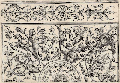
Daniel Hopfer (1471–1536)
“Design for
Ornamental Ceiling” (Composition d’ornemens), c.1505–36, from the C. Wilhelm
Silberberg (1802) edition
Etching on
heavy wove paper with margins laid
on a conservator’s support sheet
Size: (sheet) 22
x 29.3 cm; (plate) 15.8 x 23.6 cm
Signed with
monogram at centre: “D H”
TIB 17 (8). 109
(500) (Walter L Strauss & Robert A Koch [Eds.] 1981, “The Illustrated
Bartsch”, vol. 17, p. 180); Bartsch VIII.500.109; Hollstein 120.I; Funck 136;
Eyssen 113
The British
Museum offers the following description of this print:
“Ornament panel
with various ceiling designs; a candelabra motif along upper edge; a
semi-circle at lower centre, surrounded by four segments with birds, female
half-length figures, cherubs, etc among foliage.” (http://www.britishmuseum.org/research/collection_online/collection_object_details.aspx?objectId=1520976&partId=1&people=120691&peoA=120691-2-60&page=1)
Condition:
richly inked, crisp impression with generous margins in excellent condition,
laid onto a conservator’s sheet of fine washi paper.
I am selling
this iron etching by the legendary Daniel Hopfer—the first artist to use
etching for prints on paper—for the total cost of AU$174 (currently US$129.57/EUR116.08/GBP100.64
at the time of posting this listing) including postage and handling to anywhere
in the world.
If you are
interested in purchasing this ornamental design from the Renaissance era,
please contact me (oz_jim@printsandprinciples.com) and I will send you a PayPal
invoice to make the payment easy.
This print has been sold
Tonight’s
discussion didn’t go to plan as the print that I had intended to talk about—a
stunning Japanese woodblock print by the legendary Utagawa Hiroshige—needed too
much research and I simply ran out of time. Consequently, I’m back to showing a
much easier to research print by the first artist to make an etching (in the
sense of a formal print) the equally legendary Daniel Hopfer.
The reason that
I mentioned my plan to discuss Hiroshige is not incidental as at the moment my
brain is still back to thinking about how the compositions underpinning Japanese
prints are designed to be read and how the Japanese approach to design is so
different to my own—the Western approach.
To explain what
I mean, when I look at this Hopfer I can see a considerable difference of
intention even concerning seemingly trivial issues. For instance, Japanese
prints do not rely on the same Western conventions of light and shade to render
form. Indeed, with the exception of only one print that I can recall—and it was
copying Western conventions and so it doesn’t really count—no traditional Japanese
print uses side lighting. By contrast, in the case of this Hopfer, the
rendering of forms (e.g. the mermaids featured on the left) show clear use of
side lighting to make their bodies seem three-dimensional. I must hasten to
mention, however, that Hopfer use of side lighting is inconsistent as the
mermaids are lit for the top right, whereas the bird flapping its winds below
the mermaids is lit from the bottom right. Of course, as this is a design created
for ceilings, Hopfer choice to use light coming from a range of directions is fully
understandable given that the design is for rooms with unknown
light sources.


No comments:
Post a Comment
Please let me know your thoughts, advice about inaccuracies (including typos) and additional information that you would like to add to any post.